One of the best books I have seen so far in Swiss Graphic Design. Contributions from Designers Karl Gerstner, Herbert Leupin, Siegfried Odermatt, Hans Erni, Max Schmid, Fred Troller and Kurt Wirth amongst others.


After analyzing a number of significant examples of this new modern work, Tschichold moved to the forefront of modern design with “elementare typographie,” a special issue for the trade journal Typographische Mitteilungen in 1925.

Die neue Typographie (1928; The New Typography; A Handbook for Modern Designers), which expounded the principles and functional uses of Modernist typography to printers, type compositions, and designers. he advocated the new ideas in type, which called for simplicity, and clarity in communicating a design’s message. This book was meant as a guideline for the German printing industry stating rules of the do’s and don’ts of the new type to change the established practices of the industry. Some of the rules included were; type should be asymmetrical in layout, type should be at its simplest form without embellishment, and rules should be used for emphasis. Tschichold’s book was criticized by some because they thought the book was trying to strictly put rules to this new type, but the book was highly praised by the majority.

A Swiss Way
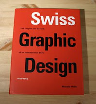
The Swiss attitude to design is recognised across the world. So far it has been a powerful inspirational source for me as a designer. In this post I have taken notes from the book “Swiss Graphic Design, the Origins and Growth of an International style 1920 – 1965” and report on the developments of the Swiss style and what has influenced the Swiss Graphic design style.
What I like about Swiss graphic design or International style as it was latter know from the 1950’s as it was exported internationally, is that is emphasizes cleanliness, space, clear message readability and precision in the compositional layout.
The Swiss have always really enjoy the “graphic culture”. They like flags for instance as each town and district, as a reminder of it’s identity within the canton, has it’s own banner. The also have coats of arm which appear on all official documents. The federal authorities have acknowledged the importance of graphic design, as Switzerland was the first country to have it passport professionally designed. Public commissions, such as bank notes and stamps are in general as result of competition, as are posters for national events. I was reading also on a website that they have also used the term “graphic design” a lot longer than any other European country, due to the poster competitions.
There are a few factors to account for the Swiss style – the country and it’s neutral position, language, Northern Switzerland was where the progressive ideas were proposed attacked and depended in the 1920’s in Basel and Zurich. (Look into the ideas that were proposed)
Another was huge cultural factor was the Swiss interest in precision, craft skills, widely admired education system and technical training.
The origins of the Swiss style started from the revolutionary political and cultural upheaval of Europe following the First World War where Russia was taken over by the Bolshevik Dictatorship. During this time Russia where the source of radical aesthetic innovations. Germany, was where the Modern Movement was pioneered. During the wars Switzerland was under total unrest as a neutral country. It looked after the exchange of wounded prisoners and was a sanctuary to people.
Between the two wars the comfortable and confident society revelled in modern life. The industrial possibilities brought about new technologies, And the working class fought and the intellectuals fought with manifestos.
The artist made startling revolutionary art. This big demand for change and the search for new aesthetics created creative groups like the modernist. The progressive graphic designers among the modernists shared with architects a modern aesthetic, an abstract, geometrical style. This was the making of new reform and making a “new world”.
In the 1930s Switzerland was occupied by Hitler and in south by Mussolini’s fascist Italy. Tension was on the increase in Switzerland. Modernism survived the war, thanks to artist designers. Painters left their easels to work as Graphic Designers.
References to constructivism and concrete art. Constructivism was the foundation for many of the principles in modern movement in art and design. Constructivism originated from Russian alongside the political revolution. Constructivism declared “war on art”. It’s appeal was more aesthetic than political. It had clear use of geometry flat colours and diagonal axis of asymmetry and photography. Influential was the constructivist’s practice of photograph. The aim was an impersonal recording of objects and events.
Concrete art extended the constructivist aesthetic by adding mathematical thinking. The use of maths applied to the geometric shapes in organised space, add to two-dimensional design.
New word terms were emerging and the 1920s “new” meaning “Neue typographie” and “Elemental” “Elementare typographie” related to Jan Tschichold; “functional” in “funktionale typographie” associated with Max Bill; “integral” integrale typographie” by Kar Gerstner.
In the1950s Swiss style was dismantled in its home country, while in the rest of the world it had become common visual language. It had become the language of large corporate companies design and public service design for signage, booklet and brochures. Swiss design magazine found a new international market. Swiss designers were most wanted in schools and university and are was for this reason that the term “international style” originated.
New Graphic Design 1920 -1938
Modern designers began because artist was looking for new role in the industrialised society. The First World War artist brought about a revolution in design of print. This introduced as a new typography. Out went symmetry, ornaments and drawn illustration. In came space, plain lettering and photographs. The new typography evolved from 1920-1930 and became the Swiss graphic style.
Henri Van de Velde was a leading figure and was a pioneer of modern design. His aim was to make a new style based on principle.
Artists engaged in new formal and visual language, engaging in the cultural and industrial mass society. A Group In the 1920-1930 – Deutscher Wekbund aimed at bringing together art and industry. Henry became one of the members.
Werkbound was the main topic of discussion and they had a journal Die Form. This reported new advertising design and type, in graphics and in the use of photography. In 1920-1930 Werkbund exhibitions travelled to Switzerland. This was progressive design.
The Swiss journal founded in 1913 with the same aims as German counterparts. Their monthly journal was Das Wark. Industrial graphic being seen as the seed of Graphic Design.
Bauhaus – provided manual training workshops, theoretical laws, prepare for mass production. The Swiss interest in school continued till its closure in 1933. The Bauhaus exhibition was reported in Swiss Werbunks monthly, Das Werk. Art historian Sigfried Giedion wrote the objectives of the Bauhaus.
Bauhaus – their work attracted a new society.Laszlo Mohly Nagy said is a “new communication tool” and developed new “typofoto”. Swiss designers relied on Bauhaus publication for approach to typo.
Max Bill and Theo Ballmer came home to Switzerland in 1929.
Henry functionalist attitudes of Bauhaus shared the formal geometrical aspect.
Studio Boggeri – was where most Swiss designers worked in 1940 -1950.
Bauhaus survived in Switzerland due to Sigfried Giedion.
Henry Van de Veldle wanted to make art socially useful.
Constructivist spread from Moscow to Europe. Pure colour and geometric form. Constructivist founded new typo. Constructivism originated as an ideology rather than a style. Constructivist aimed at to integrate art and society.
The congress of constructivist and Dadaist in Weimar had been attended by all artists who contributed to new typo.
Merz magazine carried the progressive message to Switzerland. Die form, the Werkbund journal was another. Among contributors of Graphic design was Johannes Molzahnnes – being the most significant theorist. He worked in contact with Groupius. Molzahns essays “economics of advertising mechanics”.
Die form writers were – Max Burchartz and Werner Graeff who played their part in introducing Modernism to Switzerland.
What is the current international style in the Switzerland today? What are its new principles if any? Are there any new movements? How has the Swiss style evolved from past to present? What has been contributing factor in its style?

